Hospitality
·
Enterprises Platform
Designing for India's Most Iconic Hotel Brand
A unified campaign management platform built from the ground up for IHCL replacing three fragmented tools with one purpose-built system for 100+ Taj properties.

MY ROLE
Senior Product Designer
DURATION
5 Months
PLATFORMS
Web · Internal Enterprise
Type
End to end product design
Guest users
Pre-login only
6 pages audited
15 OTAs benchmarked
40+ annotated issues
500+ reviews analysed
The tools didn’t talk to each other
IHCL's marketing operations were running on three disconnected tools and the seams between them were costing real time, real money, and real decisions.
3+
Tools for a single campaign - no shared data model, no unified reporting
Campaign manager · Google analytics · Excel
7x
Tools switching moments in one campaign lifecycle - from brief to performance report
Source: User interviews and analytics data.
User type 1
Marketing managers
Responsible for creating, scheduling, and managing campaigns across IHCL's property segments from luxury palaces to business hotels. Need speed and guided creation flows.
Create campaigns without switching tools mid-flow
Reuse audience segments across properties
See campaign status at a glance, not in a spreadsheet
User type 2
Analytics teams
Responsible for tracking performance, building reports for leadership, and making optimization recommendations across the campaign portfolio. Need data density and self-serve flexibility.
Cross-property performance in one view
Self-serve reporting without requesting data exports
ROI visibility linked directly to campaign activity
Business stakes
No unified ROI view leadership couldn't see cross-portfolio performance without a manual analyst effort, delaying decisions by days
Team stakes
3+ years of workflow habits across existing tools a full platform change carried real rejection risk if existing mental models weren't respected
Scale stakes
100+ properties with different segments, audience sizes, and campaign types the system had to handle variability as a first-class design requirement
Build the system before the screens
The instinct on a product like this is to start with the dashboard. I started with the design system because without a stable foundation, every screen decision would create rework.
Approach
How i got there
01
Lean stakeholder research: 3 sessions with marketing + analytics teams mapping the "as-is" workflow understanding what each tool did, where it failed, and the workarounds teams had built to survive the gaps between them.
02
Workflow archaeology: traced every step from campaign brief to performance presentation identified 7 tool-switching moments, each representing a data reconciliation risk and a time cost.
03
Reference analysis: studied Salesforce Marketing Cloud, HubSpot, and Sprinklr for enterprise campaign UX patterns specifically how role-based navigation is handled without splitting a platform into two separate products.
Trandeoffs
Hard choices made
Single interface vs Role-based views
Platform architecture
Considered
One unified interface same view, same navigation for both user types
Choosen
Role-based views separate navigation and hierarchy per user type, shared data layer
Chose because: Marketers need creation tools; analysts need data density one interface can't optimise for both without failing both.
Cost: Doubled design surface to 150+ components and required more complex permission logic from engineering.
Greenfield redesign vs Familiar mental models
Migration strategy
Considered
Clean slate ideal workflows regardless of existing team habits
Choosen
Familiar mental models elevated mirror existing task sequences, upgrade the architecture underneath
Chose because: Teams with 3+ years of habits need continuity — matching familiar sequences reduces change resistance and shortens the adoption curve.
Cost: Inherited some suboptimal flow patterns from existing tools — deferred to later iterations rather than fixed on day one.
Four Features. One Unified System.
Each feature was designed to eliminate a specific gap from the old 3-tool workflow with a rationale for every decision and space for the work to show itself.
The product replaced three separate tools without requiring teams to unlearn their existing workflows. The key was to preserve task sequences while removing the tool-switching friction between each step — making the new experience feel like a natural upgrade, not a foreign replacement. Every feature below has a specific reason it exists, a design decision that made it work, and an image slot for the screen that shows it best.
Design system foundations per feature
Dashboard uses summary pattern action-first card components for marketers.
Campaign builder uses form pattern step-locked stepper with validation states.
Segmentation uses data-entry pattern tagging, filtering, and condition-builder.
Analytics uses data-dense pattern chart containers, table, and filter components
Single interface vs Role-based views
Platform architecture
Considered
One unified interface same view, same navigation for both user types
Choosen
Role-based views separate navigation and hierarchy per user type, shared data layer
Chose because: Marketers need creation tools; analysts need data density one interface can't optimise for both without failing both.
Cost: Doubled design surface to 150+ components and required more complex permission logic from engineering.
01
Role based dashboard · Entry point
Two Users. Two Entry Points. One Platform.
The dashboard is the first screen after login — and it needed to answer a different question for each role. Marketers see campaign status + quick-create as their priority. Analysts see performance data + anomalies. Same underlying data, two compositions designed around what each role needs to act on first.

Design Decision
Role is set at login — no toggle or switch mid-session. Switching context mid-task creates cognitive load; each role should land in their flow immediately.
What to show
The campaign status module (marketer view) and the performance overview module (analyst view) — point out how the same campaign card looks in each context.
Interview talking point
The decision to use role-based views vs a single interface was the hardest architectural call — explain the tradeoff between surface area cost and UX quality for both users.
02
Campaign builder · Core creation flow
Guided creation that prevents errors before they happen.
The old Excel-based workflow meant missing fields weren't caught until reporting time — two weeks after a campaign launched. The stepper builder uses step-locking with inline validation: each step validates required data before unlocking the next. Errors are caught at the point of entry, not at the point of consequence.

Design Decision
Stepper over single-page form — a 5-step flow reduces perceived complexity and surfaces the right fields at the right moment, matching how campaign briefs are actually written.
What to show
The step-locked progress bar, an inline error state on a required field, and the draft-saving confirmation — three micro-interactions that together eliminate the main pain points from the old workflow.
Interview talking point
The stepper was a deliberate decision against the single-page form pattern. Explain why — technical users often prefer single-page forms, but for this user type, guided steps matched their mental model of how a campaign is built.
03
Audiance segementation · Data unification
One defination. Every campaign. Every property
Segmentation was previously defined differently across Campaign Manager and GA — the same audience had different names and sizes depending on which tool you checked. Unified segmentation means one source of truth: segments are created once, reusable across all 100+ properties, and consistent across every report.

Design Decision
Segment library is shared and searchable not per-campaign. Teams build segments once and reuse them, preventing the definitional drift that made cross-property comparison unreliable in the old setup.
What to show
The condition builder, the "estimated reach" counter that updates live, and the segment card in the campaign builder showing how segmentation connects to the creation flow.
Interview talking point
This feature required the most cross-functional alignment the data model behind unified segments needed engineering decisions made alongside design decisions. Explain how that collaboration worked.
04
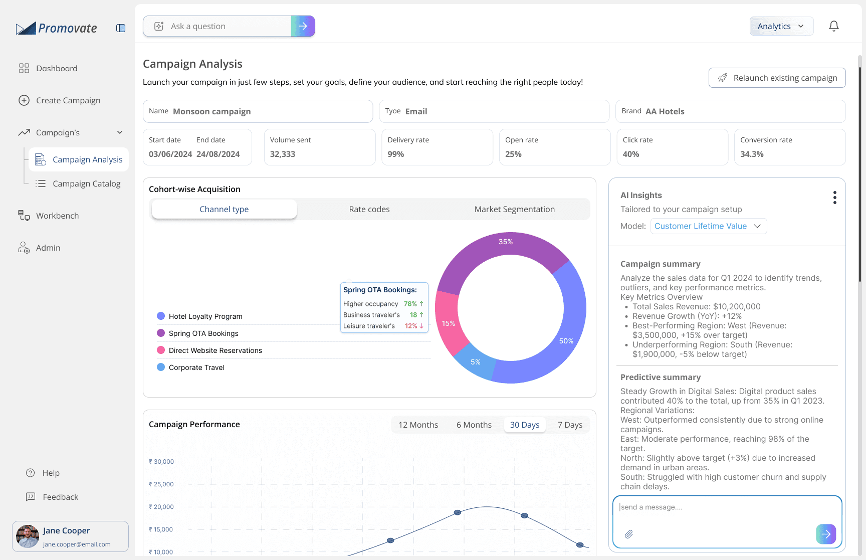
Inline analysis · Self serve reporting
Performance lives inside the campaign not in another tool.
Previously, campaign performance lived in GA, was reconciled in Excel, and presented in a separate deck. Inline analytics gives marketers self-serve reporting for routine metrics, reducing analyst dependency for day-to-day queries and giving analysts bandwidth for strategic work instead of building routine reports on request.
Design Decision
Performance data is embedded inside the campaign, not in a separate tab or section. The proximity of creation and performance data was a deliberate decision — it closes the feedback loop for marketers without requiring a context switch.
What to show
The inline chart within the campaign detail view, the date-range selector, and the export-to-PDF button — show how a marketer can go from campaign status to performance insight without leaving the screen.
Interview talking point
This was where the analyst and marketer views diverged most. Analysts get a full analytics tab with cross-campaign comparison; marketers get inline charts per campaign. Same data, different scope — explain how you decided where to draw the line.
What Changed
Measured post-launch against the same workflows that were benchmarked before the platform was built.
Efficiency gain measured via task completion benchmarking with identical campaign briefs pre and post-launch. Component count and tool consolidation are objective delivery metrics. Adoption reflects qualitative team feedback collected 4 weeks post-rollout.
Measured · Post launch
40%
Faster campaign creation
Marketing teams vs 3-tool workflow. Task benchmarked with same campaign brief.
Delivery metric
3→1
Tools Consolidated
All 7 tool-switching moments eliminated. One platform, one data model.
DELIVERY METRIC
150+
Reusable components
Design system built before features full library with usage docs for both UI patterns.
Qualitative · 4 weeks post launch
↑
Fee-Related Support Tickets
Marketing and analytics teams preferred new platform. Campaign builder and inline analytics cited as highest-value features.
Two things i carry forward
What I'd do differently
Run a dedicated accessibility audit on the analytics dashboard before shipping. Data-dense tables and chart components were designed under deadline pressure for desktop — and mobile accessibility was deferred as a future-iteration concern. For a platform used across 100+ properties with varied device contexts, that was a call I'd reverse. Accessibility at the design stage costs far less than retrofitting it in the backlog.
Core learning
Replacing existing tools is not a UX problem — it's a change management problem with a UX surface. The design decisions that moved the needle most weren't the visual ones. They were the ones that preserved team confidence during transition: keeping familiar task sequences, using known terminology, and not asking users to unlearn their workflow on day one. The best product upgrade often feels like the smallest one.